Social Security Administration Guide: Alternate Text for Images

Social Security Administration Guide: Alternate Text for Images, Version 1.2
July 2011
Copyright
The U.S. Government retains a nonexclusive, royalty-free license to publish or reproduce these documents, or allow others to do so, for U.S. Government purposes. These documents may be freely distributed and used for non-commercial, scientific and educational purposes. Electronic and hard copies should not be modified from this source material without the express and prior written permission from the Social Security Administration.
Disclaimer of Liability
The United States Government nor any of their employees, makes any warranty, express or implied, including warranties of merchantability and fitness for a particular purpose, or assumes any legal liability or responsibility for the accuracy, completeness, or usefulness of any information, apparatus, product, or process disclosed, or represents that its use would not infringe privately owned rights.
Disclaimer of Endorsement
Reference herein to any specific commercial products, process, or service by trade name, trademark, manufacturer, or otherwise, does not necessarily constitute or imply its endorsement, recommendation, or favoring by the United States Government. The views and opinions of authors expressed herein do not necessarily state or reflect those of the United States Government, and shall not be used for advertising or product endorsement purposes.
Trademarks
Many designations used by manufacturers and sellers to distinguish their products are claimed as trademarks. Where they appear in this publication, and where they were known to the publishing agency, the designations appear as prescribed by the owner’s general trademark guidelines. Other product names may appear in this publication, are used only in an editorial fashion for the benefit of the owner, and with no intention of infringement of any trademark.
Adobe, Adobe Acrobat, Adobe Illustrator, and Adobe Photoshop are registered trademarks or trademarks of Adobe Systems Incorporated in the United States and/or other countries.
Microsoft and Windows are either registered trademarks or trademarks of Microsoft Corporation in the United States and/or other countries.
Suggested citation
To cite the work in this guide, use the following information:
SSA-ARC (2010). Social Security Administration Guide: Alternative text for images, Version 1.2. Available from: Social Security Administration—Accessibility Resource Center, 6401 Security Boulevard, Baltimore, Maryland, 21235, USA.
Key concepts—images and alt-text
Alternative text is needed for images, links, controls and form elements
Screen reading software is used by people who are blind or who have low vision. Screen readers can only speak text that is in the document or web page. For any non-text content, text must be added, so that alternative non-visual presentation of the information is possible. Alternative text:
-
is read by screen readers in place of images, allowing the content and function of the image to be accessible to people who cannot see;
-
is also used by voice input software (the kind used by many people who cannot use their hands) to speak elements on the screen; and
-
provides a semantic meaning and description to images that can be found by search engines.

To locate guidance on alternate text for links, controls and form elements, see Agency-specific information at the back of this document.
General guidance

-
should be succinct:
-
should convey in words the same information that is communicated by the image.
-
should represent the purpose and function of the image, not just describe its appearance.
-
should not contain extraneous information that is not needed to convey the purpose of showing the image.
-
should not be too lengthy. The amount of text depends on the type, and the purpose of the graphic. Where a long description is needed, there are mechanisms other than alt-text that can be employed.
Formal requirements for alternate text are provided in the section on Agency-specific information.
When to add alternate text to Images
Screen reader software cannot analyze images, and therefore cannot convert images/graphics to text automatically. To address this limitation, text is programmatically attached to an image. The Screen Reader software then reads this alternate text” when an image is shown.
Whether to add alternate text depends primarily on the type of image. There are three main types of image:
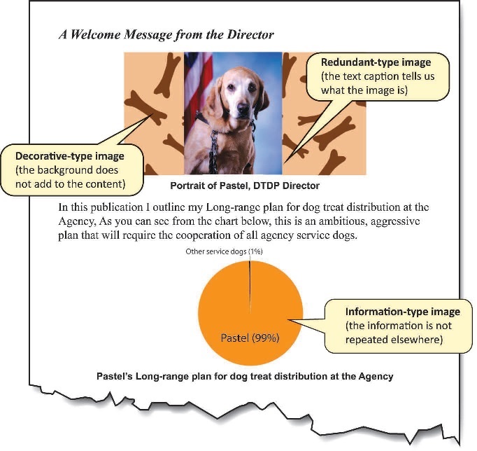
1. Information-Type images convey important information not contained in the adjacent text:

Information-Type images definitely need alt-text. Use the guidanced [sic] in Section 1 to determine how the alt-text should be presented to the reader.
2. Redundant-Type images contain information that is repeated/duplicated in adjacent text or added as a caption associated with the image:

Redundant-Type images require a judgment to be made about whether to provide alt-text. Alt-text is ordinarily avoided where it is redundant. If the meaning and purpose of an image is contained within the surrounding text, then there is no need to make screen reader users listen to the same information twice.
3. Decorative-Type images contain no information necessary for the comprehension of the document’s content:

Decorative-Type images definitely do not need alt-text.
How this guide is organized
There are three main sections in this guide:
Section 1. Reference samples and guidance provides advice on what to do and what not to do for different interface elements
Section 2. Common mistakes are referenced from the Section 1 content to alert you to the things you should try to avoid.
Agency-specific information provides the ‘nuts-and-bolts’ of coding for images.
Key to symbols:


About the sample images and text
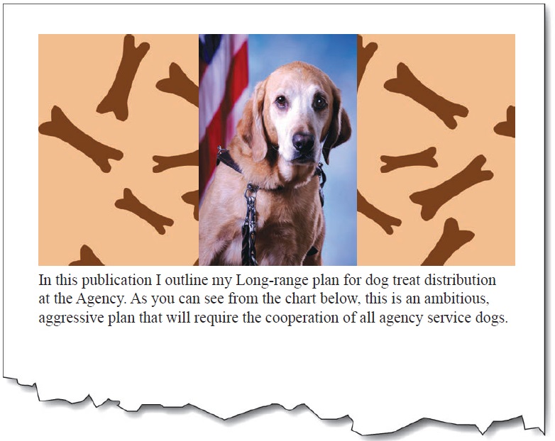
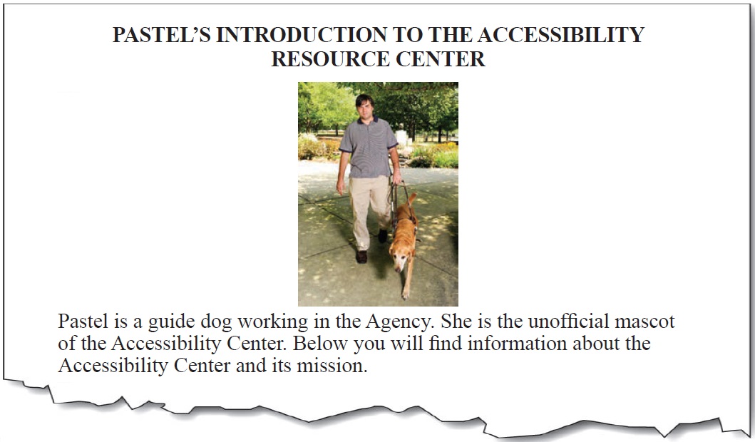
The Social Security Administration’s Accessibility Resource Center (ARC) authored this guide. The star of the images is Pastel, the unofficial ASB mascot. Pastel has a few plans to change the way dog treats are distributed at the Agency.
Pictures

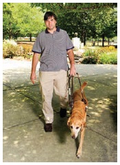
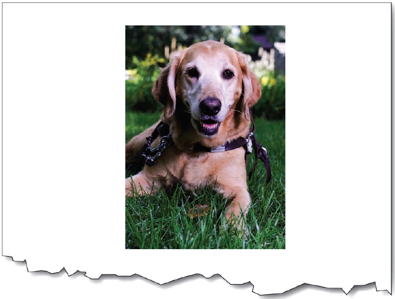
Guiding is a partnership between the dog and the handler. The handler wants to go somewhere, and the guide dog has to get the handler there safely. To achieve this, decisions are required of both team members. For example, in crossing a street, guide dogs do not have the capability to read traffic lights and “cross now” signals for pedestrians.


It’s not including the purpose. The picture is of a dynamic action of guiding. Providing static descriptions of active images is not conveying everything that is pertinent.
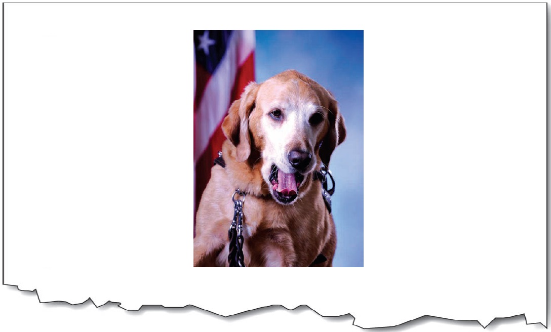
Portraits (head-shots)

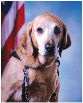
Pastel Bosken


It’s not including the pertinent flag background.
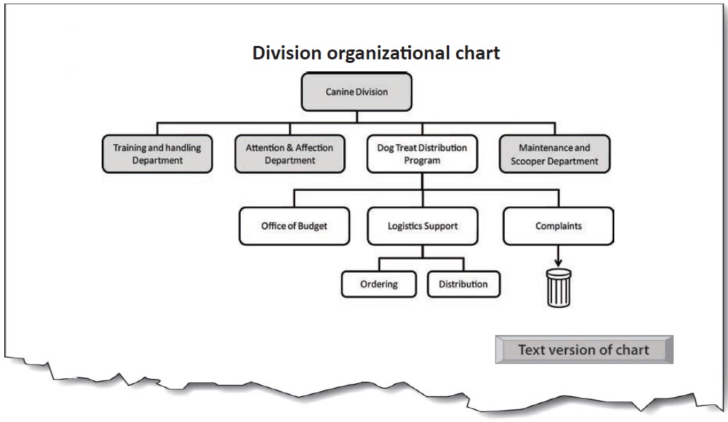
Charts, diagrams and illustrations


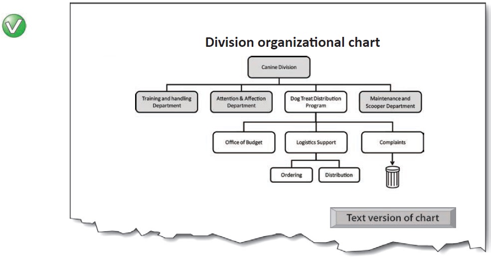
Main chart image: Alt = “”
Button—Text version of chart (content is revealed on activation):
Organizational chart for Canine Division, with Dog Treat Distribution Program hierarchy expanded.
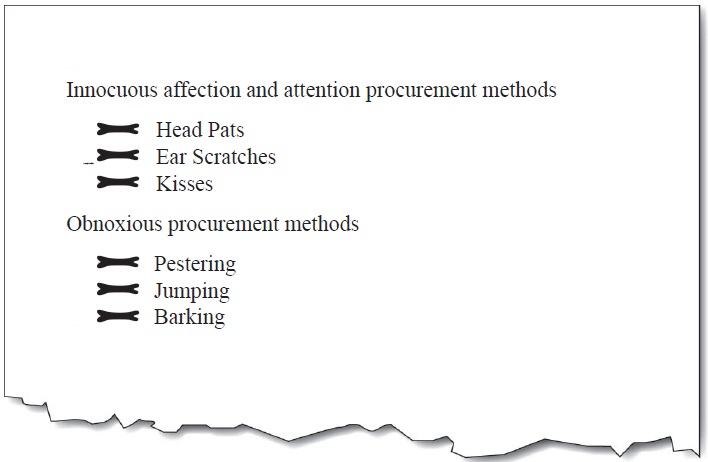
The four main departments of the canine division are:
-
Training and handling department
-
Attention and affection department
-
etc.
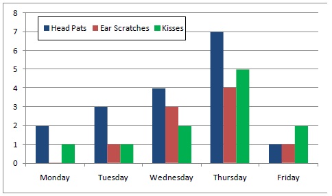
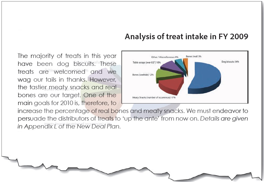
Chart 17. Attention and Affection Performance Figures - Week 32
Mondays and Fridays continue to be a problem that the working group are investigating (Chart 17). Future work will involve methods for turning the comparatively high number of head pats into ear scratches.


It doesn’t tell us the trend (the main purpose of the chart).
It doesn’t tell us anything.
It gives data… but the purpose of the chart isn’t to display data; it’s to convey a meaning found in the data. (Tables are for showing data).
It gives additional information not shown on the chart. This is [sic] a bit like using a ‘tool-tip’ to squeeze additional information into a chart. The alternative text should only be for conveying what is shown in the chart for all users.
Logos


It omits the important meaning of the yin-yang symbol.
It’s an abbreviation; not verbatim text.
Controls and form elements

-
media player buttons,
-
menu items,
-
table sorting buttons
-
form controls (e.g. ‘submit’) buttons
-
etc.
Links
See ‘Agency Guide: Alternative text for links, controls and form elements’ (a link to the guide is provided in the back pages of this document) for.
-
images that are links,
-
links containing images
-
icons in links (PDF file, Zip File etc.)
-
etc.

Image maps

-
They have become an outdated method of presenting links;
-
It is easier to use CSS for laying out links on different areas of the screen;
-
Screen magnifier users almost always find image maps impossible to use effectively; and
-
Screen reader software is commonly able to tab to the areas of the image map, but the alt-text is not automatically exposed during the process.

Text contained in an image


It omits the humor of the yawn… because only the text is relayed, not the images.
It’s not verbatim.
Text rendered as an image


It’s including information that does not add to the content.

Bullets


It’s more important to identify it as a bullet (part of a list).
Spacers (structural images)


Left image: Alt = “”
Center image: Alt = “Pastel portrait with American Flag”
Right image: Alt = “”

Left image: Alt = “Spacer long”
Center image: Alt = “Pastel portrait with American Flag”
Right image: Alt = “Spacer short”
Lines, horizontal rules, and separators

Apply alt-text to lines and separators only when there is no other means of conveying the indicated change. The proper use of headings can make lines and separators redundant, and therefore needing only a null alt-text.
Decorative images


For Web/HTML: When an image is used only for decorative purposes, it is often best to remove the image from the page content and add it as a background image using CSS. This will remove the need for alternative text altogether and will remove the image from the semantic and structural flow of the page.

Left image: Alt = “”
Center image: Alt = “Pastel portrait with American Flag”
Right image: Alt = “”

Left image: Alt = “Dog Bones”
Center image: Alt = “Pastel portrait with American Flag”
Right image: Alt = “Dog Bones”
Background images


Watermarks

Use a watermark that has high contrast with the text so that it does not interfere with the reading of the text. Duplicate the watermark text in the first part of the document in the Page Foreground. Failing to do so will mean that screen reader users will never know the message contained in the watermark.

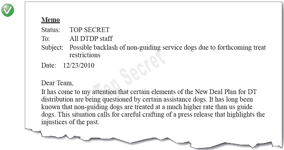
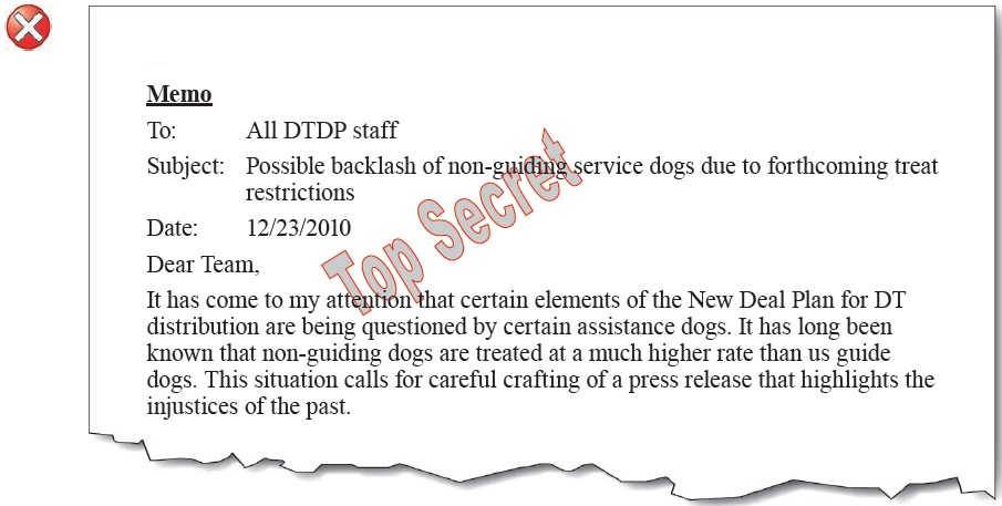
It’s low contrast, and it omits the watermark message in the main text.
Signatures

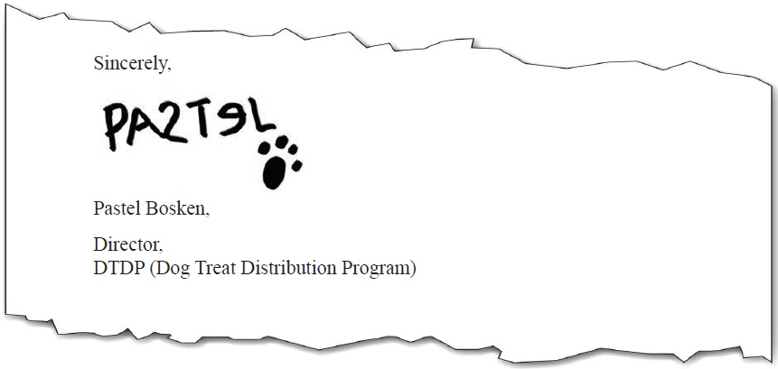


“Pastel Bosken”
It doesn’t include an identifier that it is a signature.
“Scruffy, poorly written signature of Pastel Bosken”
The extra information is not needed—and this is not the place for a handwriting critique.
Complex / ungrouped / tiled / layered images

Combine / group separate images into one when they visually and logically are presented as one. This is so that one piece of alt-text can be applied to the whole image. The same is needed for images that are produced with multiple layers. Flatten the layers into one before adding the alt-text.

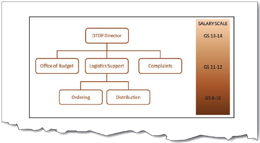
Combined images alt-text: “Organizational and Salary Chart: Top level (GS 13-14) is DTP Director; 2nd level (GS11-12) is Office of Budget, Logistics Support, and Complaints; 3rd level (GS 8-10) under Logistics is Ordering, and Distribution.”

There are two main ways to achieve this. (1) Combine the images into one by grouping them; or (2) Apply the alt-text to only one image, and apply null alt-text (Alt=“”) to the others.
Purpose and function—missing the point

A description of an image in isolation from its context is not useful for a screen reader user. Consider the examples below:
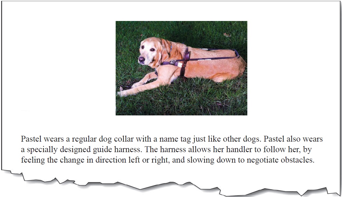

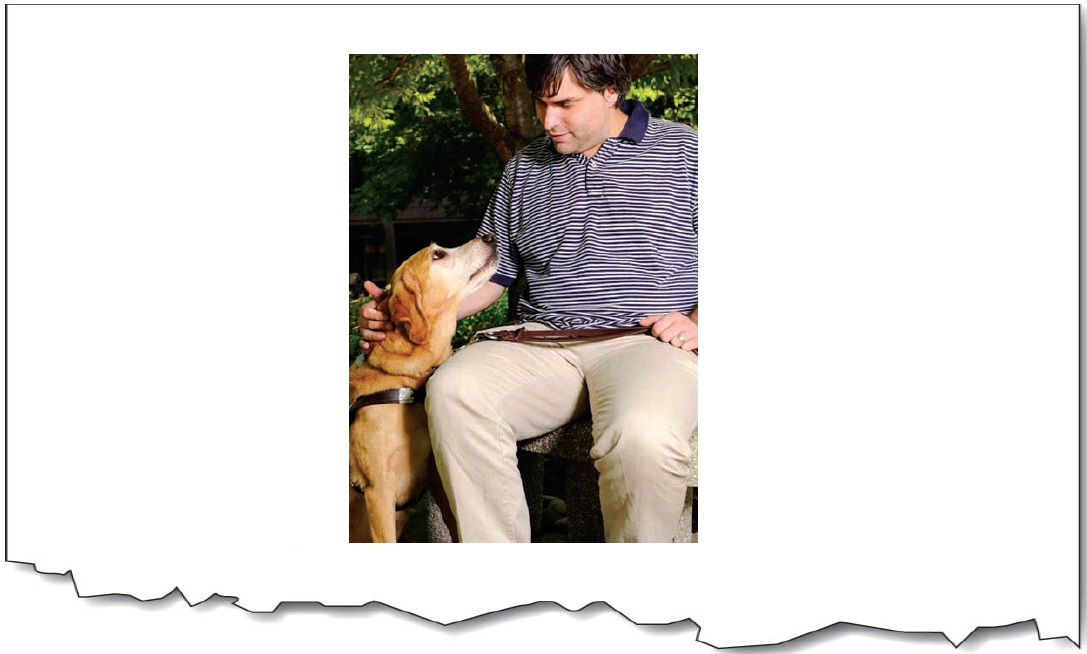
“Pastel lays in the grass and waits for instructions.”
It’s missing the point. The text surrounding the picture is all about the harness. The purpose of the picture is to show the shape and nature of the harness. The alternate text does not properly convey the purpose of the image within the context of the surrounding text.
“Pastel with her guiding harness.”
It’s missing the function. A description of the harness is not given in the text surrounding the picture. The picture shows the viewer what the guiding harness looks like, so that is what should be included in the alternate text. Again, the purpose of including a description the of the actual harness, is missed.

“Pastel’s guide harness has a handle running the length of her back. The handle is attached with leather straps that go in front of the chest and behind the front legs.”

For more examples of how to convey the purpose and function of images with alternate text, see “Appropriate Use of Alternative Text” (http://webaim.org/techniques/alttext/) from WebAIM.
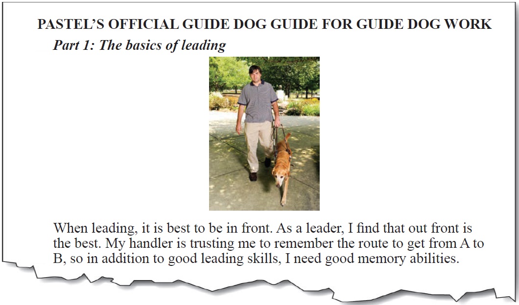
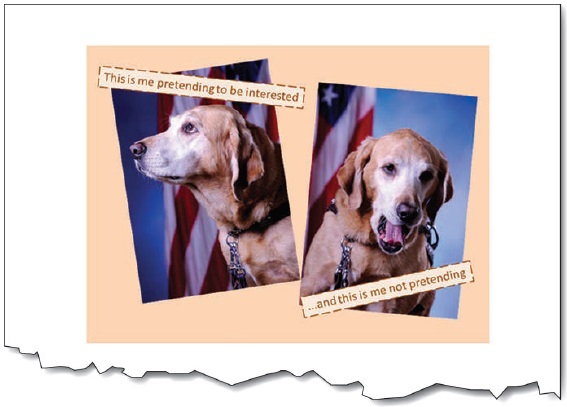
“Pastel at work”
This is the same image and alt-text as above, but it is wrong here. It’s missing key information. The subtitle (‘Part 1…’) and the text is about leading, and the image reflects the text. Here it would be useful to describe the picture in with emphasis placed on the ‘leading’ activity.
“Pastel and her handler walking. Pastel is out in front and her back legs are level with her handler’s legs.”
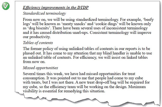
Text that is too long, verbose, wordy, replete in longness, just too much etc.


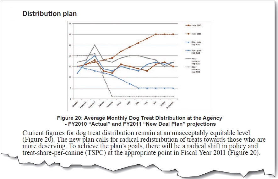

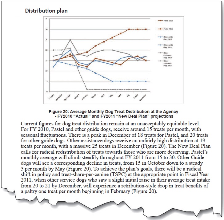
“Line chart showing average monthly dog treat distribution. For FY 2010, Pastel and other guide dogs, receive around 15 treats per month, with seasonal fluctuations. There is a peak in December of 18 treats for Pastel and 20 treats for other guide dogs. Other assistance dogs received an unfairly high distribution at 19 treats per month, with a massive 25 treats in December. The New Deal Plan calls for Pastel’s monthly average to climb steadily throughout FY 2011 from 15 to 30. Other Guide dogs will see a corresponding decline in treats, from 15 in October down to a steady 5 per month by May. Other service dogs will see a slight initial raise in their average treat intake from 20 to 21 by December, only to experience a retribution-style drop in treat benefits of a paltry 1 treat per month beginning in February.”
It’s too long. Besides the repetition of the caption text, there is too much information to be easily read in the alt-text.

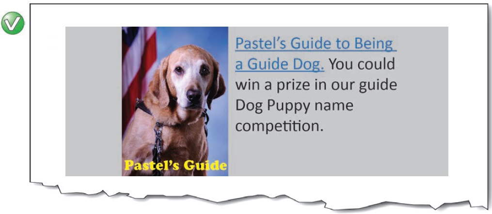
alt-text = “” (null)
It’s now redundant. The detail in the main text is probably useful for all readers, since it explains the major points of the plan. Note that in moving the reference to Figure 20 after the various explanations of the data reinforces to the reader that the figure is redundant, and therefore null alt-text is acceptable.
Redundant alt-text (now hear this… twice)
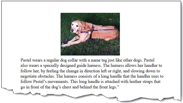

“Pastel lays down with her harness on. There is a long handle running the length of Pastel’s back. This is the handle that the handler uses to follow Pastel’s movements. The long handle is attached with leather straps that go in front of the chest and behind the front legs.”
It’s redundant. In this case, all of the pertinent information about the harness is contained in the surrounding text. Repeating this text in the picture is (a) cumbersome to read; and (b) forces the reader to have to analyze and compare both the picture text and the surrounding text to know whether they have missed any pertinent information.

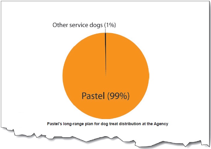
“Pie chart for Pastel’s long-range plan for dog treat distribution at the Agency. Pastel = 99%; Other service dogs = 1%”
Half of the text is already in the caption.

If the caption is in text form (programmatically attached or adjacent to the image), there is no need to repeat the caption in the alt-text because a screen reader will speak it. If, however, the caption is rendered as part of the image, the alt-text must include the caption.
Not enough, or too much detail
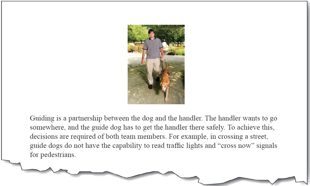

“Walking”
It’s too little information. We don’t know who’s walking? The dog only, the handler, or both as a team?
“Pastel leads her handler. It is a bright, sunny day and they walk on a garden path with trees and flowers in the background.”
It’s too much information. The descriptive information about the picture does not have anything to do with the context. They could be walking almost anywhere, but the place is irrelevant to the story.

“Pastel leads the way with her handler holding the guide harness in his left hand”.
Just enough information. The text adds information that is not in the surrounding text.
Erroneous alt-text

“Portrait photo of Pastel with the American Flag in the background”
It’s completely wrong. Sometimes in the editing process, pictures and alt-text get mixed up and mis-assigned. Here, it is clear that the text does not apply. It is essential to double check that the alt-text is what you want it to be.
Filenames and paths in place of alt-text

When you insert a picture (into Microsoft Word, for example), default alt-text is generated with the path and filename. This is useful for developers who need to find where they got the file from, but it is useless for end-users of the document who use screen readers.

“00451.jpg”
The number tells us nothing about the image.
“pastel_yawn.jpg”
Even though the filename alludes to the content in this case, the problem is that this format is not desirable for screen readers. The reader would hear “Image. Pastel underscore yawn dot jaypeg”.
“Z://Sample_Pictures/Pastel/pastel_yawn.jpg”
Like the above, but worse. The reader would hear “Image. Zee colon slash slash sample underscore pictures slash pastel slash pastel underscore yawn dot jaypeg”.
Extraneous information (‘image of…’, ‘picture of…’ etc.)

Screen reader software is usually set to announce certain elements as a means to help the reader stay oriented. For example, the screen reader will say “Table…”, “List…”, “Image…” before the element.

“Image of Pastel looking at her handler.”
Reader hears it twice: “Image. Image of Pastel looking at her handler.”.


Exception: For charts and diagrams, explain the type at the start of the alt-text. For example, “Pie chart of…”, “Organizational chart of…”.
Tool-tips on images

Tool-tips are supposed to be tips to help you use a tool. A tool is a control or widget. Something like “Play”, “Stop” or “Pause”. A link to a website, however, is not a tool; it is a link to a website. The information that users need to know should not be ‘hidden’ in a tool-tip. Often tool-tip style use for alt-text is done because of a lack of space, or because designers think the minimalist design looks less cluttered. For users with low vision who need to zoom in on the screen, tool-tips can be particularly difficult because as the mouse moves, the tip moves, making it difficult or impossible to track visually.
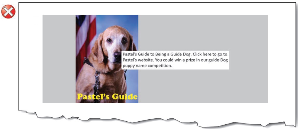
It’s a tool-tip, and essential information is hidden from normal view.
Color meaning embedded in alt-text

Information conveyed through color must also be conveyed textually. The information conveyed in text may be placed in the alt-text, but it should not be the only place that the text is shown. The information should be clearly visible at all times for all users of the interface. Using alt-text attributes to “pop up” information normally conveyed in color is inappropriate, because people who have color vision problems are not required to have their interface set to show alt-text on mouse-over.
![Interface controls using the alt-text to convey meaning. A dog treat ordering system with green, blue and red status indicators. On mouse over the the [sic] status is given in alt-text.](/images/13950)
It’s hiding status information in the alt-text.
![In this better version, the interface indicators have color and an a [sic] symbol to indicate status. On mouse over the the [sic] status and the association of the control are both given in the alt-text.](/images/13951)
The alt-text is redundant to the visual indicators of color and symbols.

Here it is okay to be redundant—the information needed by people who are color blind is also needed by people using screen readers.
(Un)grouped images

If images are placed adjacent to each other in order to make them look like a larger whole-image, they must be combined so that there is only one piece of alt-text. If they are not combined, then separate images each containing their own alt-text can be confusing for screen reader users who are trying to make sense of them separately.
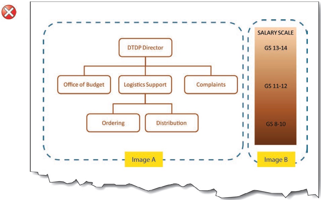
Image A alt-text: Organizational Chart: Top level is DTP Director; 2nd level is Office of Budget, Logistics Support, and Complaints; 3rd level under Logistics is Ordering, and Distribution.
Image B alt-text: Salary Scale: GS 13-14 Top Level; GS11-12 2nd Level; GS 8-10 3rd Level.
It’s separate when it looks like it’s only one image. The chart and the salary scale are two separate images, but they are clearly linked up visually. The levels on the organizational chart match up with the levels on the salary scale.
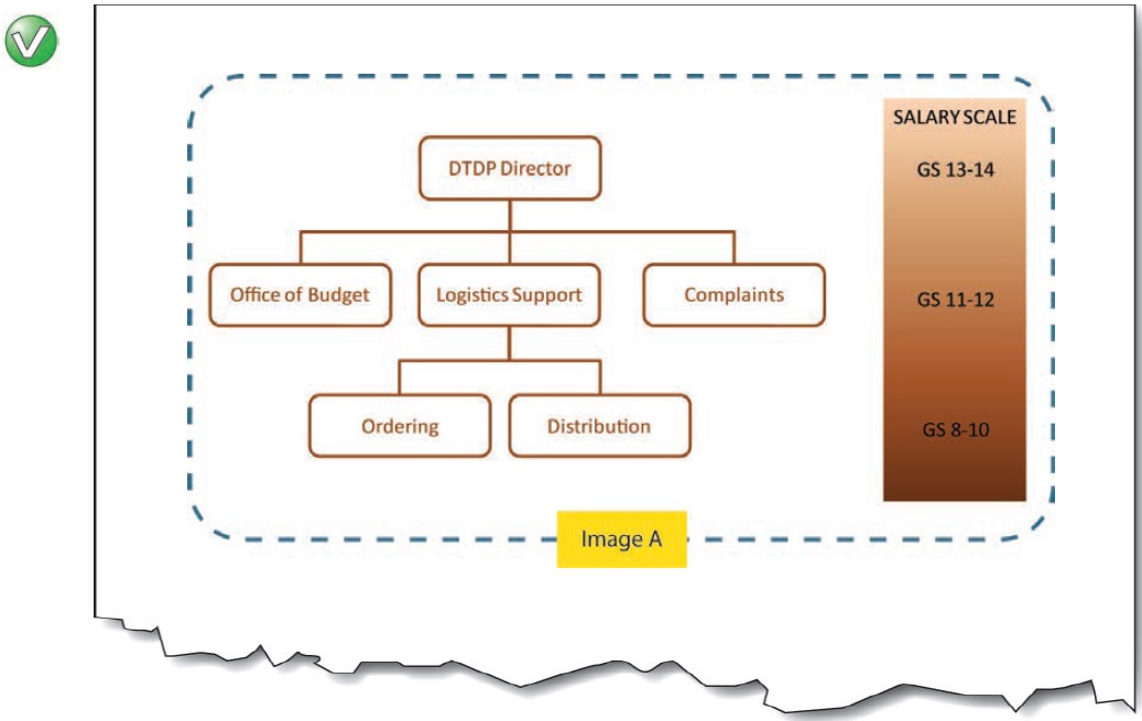
Combined image A alt-text: Organizational and Salary Chart: Top level (GS 13-14) is DTP Director; 2nd level (GS 11-12) is Office of Budget, Logistics Support, and Complaints; 3rd level (GS 8-10) under Logistics is Ordering, and Distribution.
Visual language and alt-text language mismatches

Ensure that each paragraph of text, including the logo, is programmatically marked with the correct language so that a screen reader pronounces it correctly.
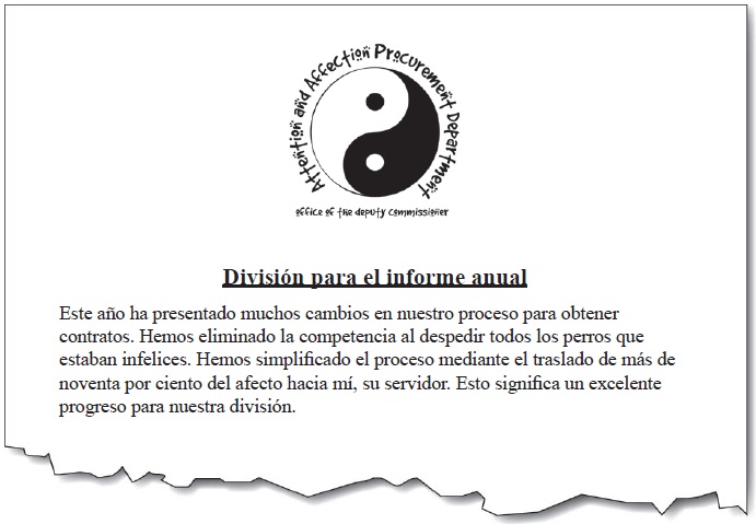

“Departamento de adquisición para atención y afecto. Oficina del Comisionado Adjunto. Yin y Yang Logo.”
It’s not the language of the logo. The alternative text should match the language displayed. It is confusing to readers who have low vision to have one language shown and another spoken.
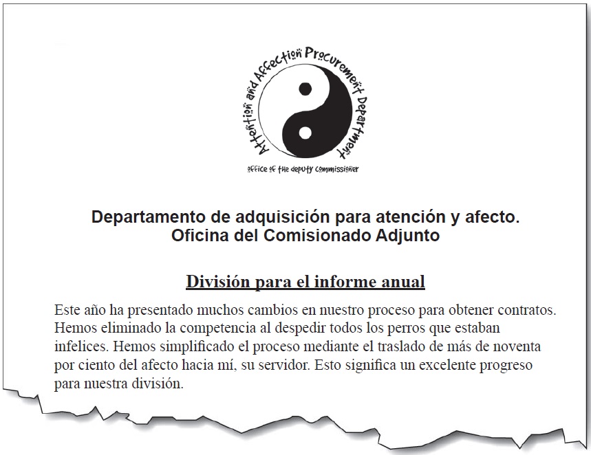

“Attention & Affection Procurement Department. Office of the Deputy Commissioner. Yin-Yang Logo.”
It’s now in the correct language. The alt-text for the logo image is in the correct language. Additionally, the Spanish language version of the department name is given text below the logo.
Web / HTML implementation

See also Agency specific information at the back of this document for links to interactive content, best practices, and sample code.
Adding alt-text to images
<img alt=“Attention & Affection
Procurement Department. Office of the
Deputy Commissioner. Yin-Yang Logo.”
src=“img/bullet.gif” />
Adding a null alt-text
Adding ‘longdesc’ for longer descriptions

If the image needs a longer description than the “alt” attribute can reasonably display, the “longdesc” attribute can be used. The longdesc is a link to an HTML file that contains a summary of the information the image contains. The HTML can be very basic and un-styled, as only screen reader users currently have access to this content.
<a href=“chart_description.htm”><img
src=“chart.jpg” longdesc=“chart_description.
htm” alt=“Chart showing revenue increases
over the last five years with link to
description of the data”></a>
The Web Accessibility Tools Consortium (WAT-C) toolbar is a useful tool for inspecting alt-text on web pages. You can view an HTML page with the images showing, and all of the alt-text next to each image. This is useful for examining whether the alt-text is appropriate within the context of the surrounding text, and ensuring that the fine details are covered. The WAT-C tool is available from http://wat-c.org/.

The example above shows the result of listing images with the WAT-C toolbar, revealing two errors.
-
It is correct that the portrait should not have alt-text, but each image should have an alt attribute even if it is null. Here it should show alt=“”.
-
There is a spelling mistake in the Pie chart alt-text. When spell checking draft content in Microsoft Word, alt-text is not included in the spell checker, so a double check with this type of tool is useful.
Adding longer descriptions with a button
Another way to provide long descriptions is to use a button or other element that displays/hides the alternative text as shown below:
Main chart image: Alt = “”
Button image: Alt=“Text version of chart” (content is revealed on activation):
Electronic documents implementation
File formats for images and compatibility with alt-text in electronic documents.
| Image File Format | File Extensions |
Microsoft® Word |
PDF converted from Word |
Remediated PDF |
| Adobe® Illustrator® |
.ai | Awkward (reads alt plus code) |
OK | OK |
| Bitmap | .bmp | OK | OK | OK |
| Enhanced metafile | .emf | OK | Inoperable | OK |
| EPS (Encapsulated PostScript) / Vector graphics |
.eps | Awkward (reads alt plus code) |
Inoperable | OK |
| GIF (Graphics Interchange Format) |
.gif | OK | OK | OK |
| Graphic Object (Microsoft) |
n/a | Partial (reads only displayed text; not alt-text) |
Partial (some object types are inoperable; others read only displayed text; not alt-text) |
OK (alt-text only; not displayed text) |
| JPEG (Joint Photographics Expert Group) / JPEG2000 |
.jpg, .jpeg | OK | OK | OK |
| PNG (Portable Network Graphics) |
.png | OK | OK | OK |
| PSD (Adobe®PhotoShop®) |
.psd | N/A | N/A | |
| Raw (Raw Image Format) | .raw | N/A | N/A | |
| Smart Art (Microsoft) |
n/a | OK (reads alt then displayed text) |
Inoperable | OK (alt-text only; not displayed text |
| TIFF (Tagged Image File Format) |
.tif, .tiff | OK | Inoperable | OK |
| Windows® Metafile (Microsoft) |
.wmf | OK | Inoperable | OK |
| Word Art (Microsoft) | n/a | OK | OK | OK |

Compatibility has been tested with JAWS for Windows® screen reading software from Freedom Scientific®. For file formats not listed, testing will be required. Conversion from Microsoft Word to PDF used Adobe® Acrobat® plug-in for Word.

To remediate a PDF with direct editing in Adobe Acrobat Pro: (1) mark the reading order for the image as ‘background’; (2) mark the image as ‘Figure’; (3) Right click the image and go to ‘Edit Alt Text’.
Microsoft Word implementation

To add alt-text to an image, first determine the type of image in order to prepare the appropriate alt-text wording (To begin, see the main types of image, p.3).
-
Right click the image and select Size…
-
Open the Alt Text Tab and type in the appropriate alt-text.
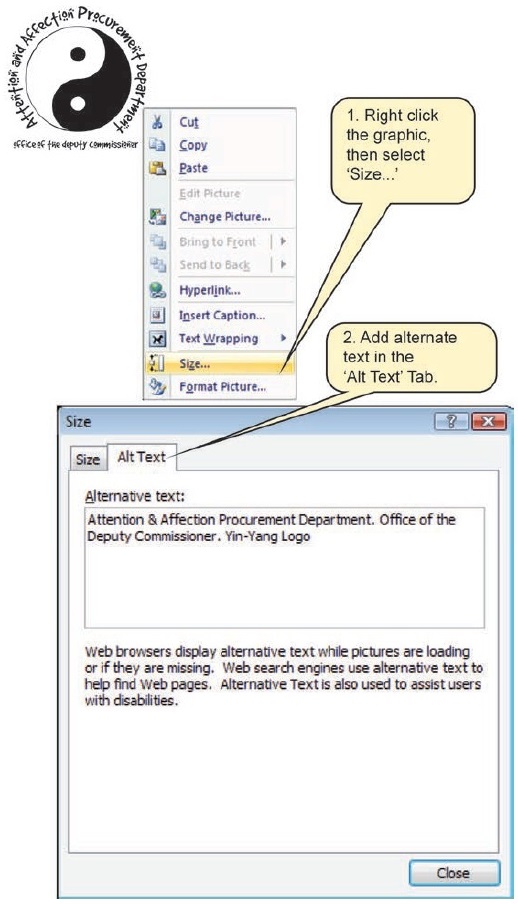
For more guidance, see Agency specific information at the back of this document.
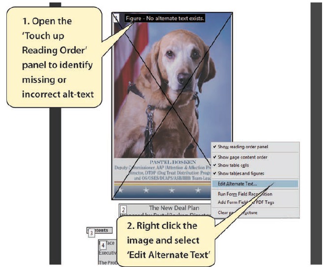
PDF (Adobe Acrobat Pro) implementation

If you are working with a master document in Microsoft Word format, it is better to edit the alt-text in Word before conversion to PDF. If you need to make changes to the master document, much less work is involved in conversion if the alt-text is already in the original Word file. For more guidance, see Agency specific information at the back of this document

To add alt-text to an image, first determine the type of image in order to prepare the appropriate alt-text wording (To begin, see the main types of image, p.3).
-
Open the ‘Touch Up Reading Order Panel’: Advanced… Accessibility… Touch Up Reading Order
-
Right click the image and select Edit Alternate Text…
-
Type in the appropriate alt-text.
The Accessibility Resource Center
This guide is produced by the Social Security Administration - Accessibility Resource Center (ARC). An electronic copy of this guide, related guides, training information and contact details for the Center can be found at:
The Section 508 ARC Intranet page: http://ssahost.ba.ssa.gov/arc/
Please note that the above link does not work outside of SSA. It is intended for SSA Intranet users only.
User Comments/Questions
Add Comment/Question