Hello. Please sign in!

Social Security Administration Guide: Alternate Text for Images

Charts, diagrams and illustrations

Information and guidance blue icon
Give the purpose and function of the chart, diagram or illustration within the context of the surrounding information. Be sure to supply any major trends or data points that are highlighted. Be sure to provide any information that is essential to understanding the image, either in alternative text, or in a longer description.

Take note yellow icon
In Web/HTML it is possible to use a long description (‘longdesc’) attribute for images  that require more information to be presented. The longdesc is not commonly used, and may be eliminated from future versions of HTML standards. Placing longer text and data in the main text or via a ‘view details’ show/hide button is the preferred alternative.

Division organizational chart

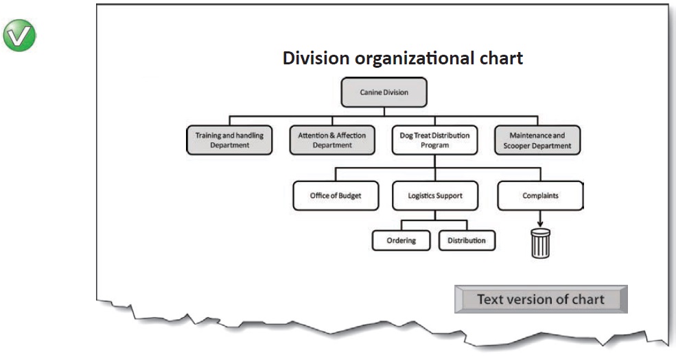
Main chart image: Alt = “”
Button—Text version of chart (content is revealed on activation):

Organizational chart for Canine Division, with Dog Treat Distribution Program hierarchy expanded.
The four main departments of the canine division are:

  • Training and handling department

  • Attention and affection department

  • etc.

Bar Chart. Figures for Head Pats, Ear Scratches and kisses climb steadily during the week from a few on Monday to around 5-6 on Thursday. There is a rapid decline, comparable to Monday levels, on Friday.

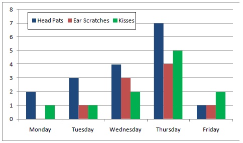
Chart 17. Attention and Affection Performance Figures - Week 32

Mondays and Fridays continue to be a problem that the working group are investigating (Chart 17). Future work will involve methods for turning the comparatively high number of head pats into ear scratches.

Right way green icon
“Bar Chart. Figures for Head Pats, Ear Scratches and kisses climb steadily during the week from a few on Monday to around 5-6 on Thursday. There is a rapid decline, comparable to Monday levels, on Friday.”
 

Wrong way red icon
“Chart of Head Pats, Ear Scratches and Kisses Monday through Friday.”
It doesn’t tell us the trend (the main purpose of the chart).


Wrong way red icon
“Chart.”
It doesn’t tell us anything.


Wrong way red icon
“Bar Chart. M-F: Head Pats: 2,3,4,7,1. Ear Scratches: 0,1,3,4,1. Kisses: 1,1,2,5,2.
It gives data… but the purpose of the chart isn’t to display data; it’s to convey a meaning found in the data. (Tables are for showing data).


Wrong way red icon
“Bar Chart. Totals for week 32 are Head Pats: 17. Ear Scratches: 9. Kisses: 11.
It gives additional information not shown on the chart. This is [sic] a bit like using a ‘tool-tip’ to squeeze additional information into a chart. The alternative text should only be for conveying what is shown in the chart for all users.

[MORE INFO...]

*You must sign in to view [MORE INFO...]