Social Security Administration Guide: Alternate Text for Images
Section 1. Reference samples and guidance
Pictures

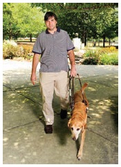
Guiding is a partnership between the dog and the handler. The handler wants to go somewhere, and the guide dog has to get the handler there safely. To achieve this, decisions are required of both team members. For example, in crossing a street, guide dogs do not have the capability to read traffic lights and “cross now” signals for pedestrians.


It’s not including the purpose. The picture is of a dynamic action of guiding. Providing static descriptions of active images is not conveying everything that is pertinent.
Portraits (head-shots)

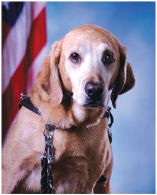
Pastel Bosken


It’s not including the pertinent flag background.
Charts, diagrams and illustrations


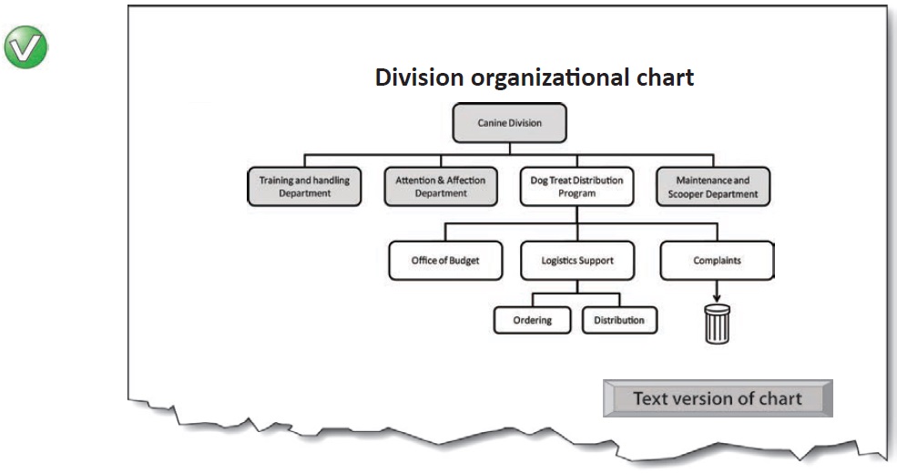
Main chart image: Alt = “”
Button—Text version of chart (content is revealed on activation):
Organizational chart for Canine Division, with Dog Treat Distribution Program hierarchy expanded.
The four main departments of the canine division are:
-
Training and handling department
-
Attention and affection department
-
etc.
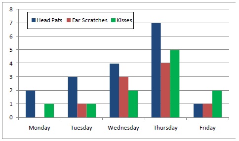
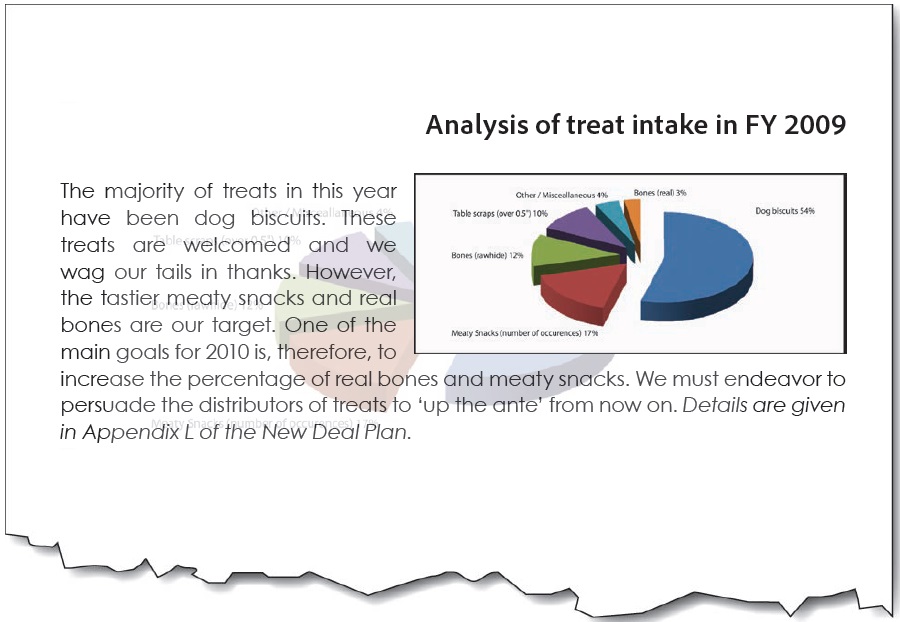
Chart 17. Attention and Affection Performance Figures - Week 32
Mondays and Fridays continue to be a problem that the working group are investigating (Chart 17). Future work will involve methods for turning the comparatively high number of head pats into ear scratches.


It doesn’t tell us the trend (the main purpose of the chart).
It doesn’t tell us anything.
It gives data… but the purpose of the chart isn’t to display data; it’s to convey a meaning found in the data. (Tables are for showing data).
It gives additional information not shown on the chart. This is [sic] a bit like using a ‘tool-tip’ to squeeze additional information into a chart. The alternative text should only be for conveying what is shown in the chart for all users.
Logos


It omits the important meaning of the yin-yang symbol.
It’s an abbreviation; not verbatim text.
Controls and form elements

-
media player buttons,
-
menu items,
-
table sorting buttons
-
form controls (e.g. ‘submit’) buttons
-
etc.
Links
See ‘Agency Guide: Alternative text for links, controls and form elements’ (a link to the guide is provided in the back pages of this document) for.
-
images that are links,
-
links containing images
-
icons in links (PDF file, Zip File etc.)
-
etc.

Image maps

-
They have become an outdated method of presenting links;
-
It is easier to use CSS for laying out links on different areas of the screen;
-
Screen magnifier users almost always find image maps impossible to use effectively; and
-
Screen reader software is commonly able to tab to the areas of the image map, but the alt-text is not automatically exposed during the process.

Text contained in an image

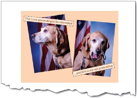


It omits the humor of the yawn… because only the text is relayed, not the images.
It’s not verbatim.
Text rendered as an image

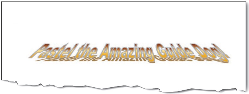


It’s including information that does not add to the content.

Bullets

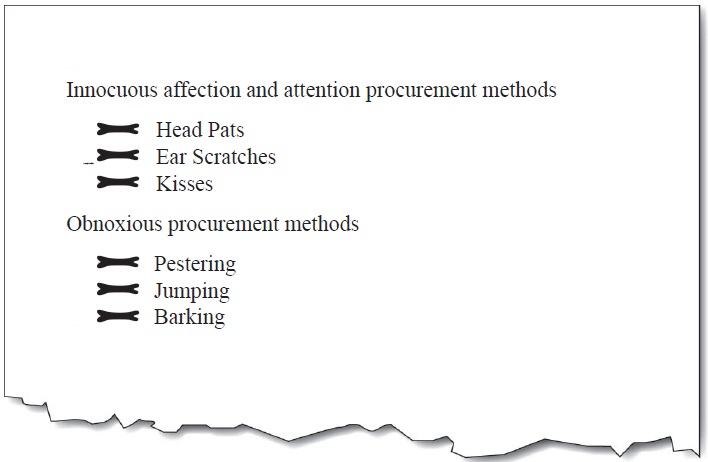


It’s more important to identify it as a bullet (part of a list).
Spacers (structural images)


Left image: Alt = “”
Center image: Alt = “Pastel portrait with American Flag”
Right image: Alt = “”

Left image: Alt = “Spacer long”
Center image: Alt = “Pastel portrait with American Flag”
Right image: Alt = “Spacer short”
Lines, horizontal rules, and separators

Apply alt-text to lines and separators only when there is no other means of conveying the indicated change. The proper use of headings can make lines and separators redundant, and therefore needing only a null alt-text.
Decorative images


For Web/HTML: When an image is used only for decorative purposes, it is often best to remove the image from the page content and add it as a background image using CSS. This will remove the need for alternative text altogether and will remove the image from the semantic and structural flow of the page.

Left image: Alt = “”
Center image: Alt = “Pastel portrait with American Flag”
Right image: Alt = “”

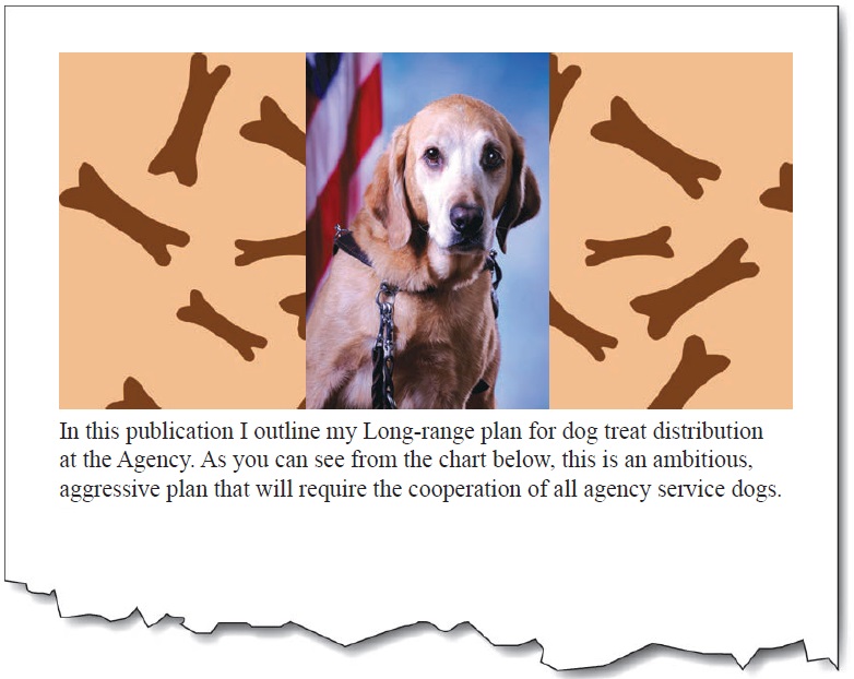
Left image: Alt = “Dog Bones”
Center image: Alt = “Pastel portrait with American Flag”
Right image: Alt = “Dog Bones”
Background images


Watermarks

Use a watermark that has high contrast with the text so that it does not interfere with the reading of the text. Duplicate the watermark text in the first part of the document in the Page Foreground. Failing to do so will mean that screen reader users will never know the message contained in the watermark.

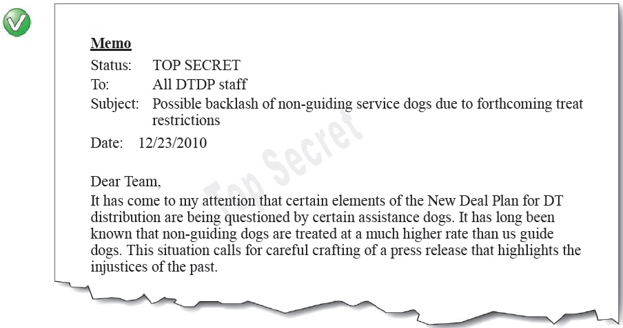
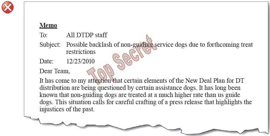
It’s low contrast, and it omits the watermark message in the main text.
Signatures

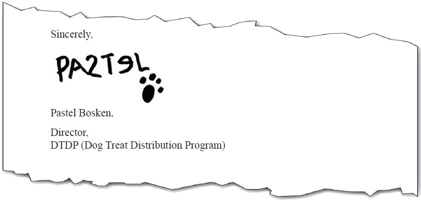


“Pastel Bosken”
It doesn’t include an identifier that it is a signature.
“Scruffy, poorly written signature of Pastel Bosken”
The extra information is not needed—and this is not the place for a handwriting critique.
Complex / ungrouped / tiled / layered images

Combine / group separate images into one when they visually and logically are presented as one. This is so that one piece of alt-text can be applied to the whole image. The same is needed for images that are produced with multiple layers. Flatten the layers into one before adding the alt-text.

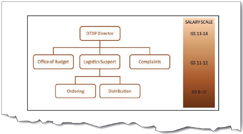
Combined images alt-text: “Organizational and Salary Chart: Top level (GS 13-14) is DTP Director; 2nd level (GS11-12) is Office of Budget, Logistics Support, and Complaints; 3rd level (GS 8-10) under Logistics is Ordering, and Distribution.”

There are two main ways to achieve this. (1) Combine the images into one by grouping them; or (2) Apply the alt-text to only one image, and apply null alt-text (Alt=“”) to the others.
User Comments/Questions
Add Comment/Question