Exhibit Design Relating to Low Vision and Blindness: Tactile Mapping for Cultural and Entertainment Venues
Fixed position maps and kiosks
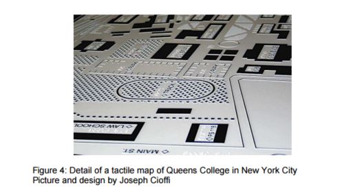
Tactile maps can also be mounted on walls and pedestals in locations where visually impaired individuals will be likely to find and identify them. These maps should be made of durable materials, since they have to withstand significant wear and tear when used as intended, and because they will be exposed to vandalism and, in cases of outdoor installations, moisture, extreme temperatures and UV radiation that can rapidly degrade unsuitable materials. Fixed position maps have been made out of various materials, from CNC-milled plastic to photographically-etched magnesium metal (see figure 4), cast metals and resins, and 3D printing.
While it is normally more convenient and practical to mount these maps on vertical surfaces, as is typical for publicly displayed maps, it is better to place tactile maps on a horizontal or near-horizontal surface. This is because tactile map readers need to imagine themselves in the environment depicted, and it is easier to do this when the orientation of the map matches reality (Ionides and Howell, 2004). When maps are placed on vertical surfaces, readers need to constantly shift their frame of reference in order to build an imaginary model of reality that they will (hopefully) retain once they are no longer looking at the map. For similar reasons, it is always desirable to rotate horizontally-mounted tactile maps so that their direction matches the real world. This way, when examining things to the left of the You Are Here marker, the reader knows that those things are actually to his left in the real world. However, it is often not practical to mount tactile maps on dead level surfaces, because they quickly become tables on which thoughtless people leave their trash.
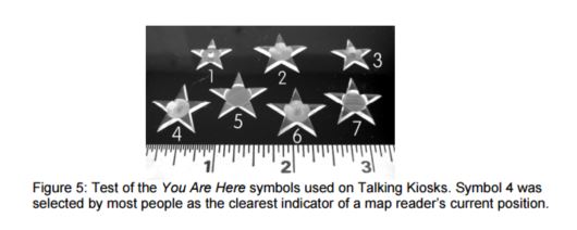
Good tactile cartography requires significant user testing to ensure that symbols, line types and textures will be readable and clear to the multiple constituencies who must be considered as potential users. As an example of the kind of research that is required to maximize usability across populations, consider the experiment carried out by Touch Graphics in developing a universal You Are Here marker that is intuitive to both blind and low vision audiences, as well as to the general public (see figure 4). We found that sighted map readers are familiar with the convention of a red star to indicate the station point of a map, but that this symbol is not known or intuitively understood by tactile readers without (recent) visual memory. We produced seven versions of a multi dimensional star symbol and asked 12 individuals to rate them for clarity as a You Are Here marker. The clear winner was a star with a fingertip-sized concave depression in its center (sample number 4 in figure 5).
With the results of this experiment in hand, we were able to produce a series of Talking Kiosks for New York City that use this symbol (fig. 6). These kiosks include translucent acrylic touch-sensitive maps placed on top of LCD flat panel displays on sloping counters (fig. 7). This enabled us to light up the map brightly, which is often helpful for viewers with low vision. Also, this approach permits us to highlight different elements on the maps as they are touched, providing visual emphasis and interest for sighted passers by, who appear to enjoy interacting with the kiosk, too.

User Comments/Questions
Add Comment/Question