Raised and Brailled Characters and Pictorial Symbol Signs [4.30.4]
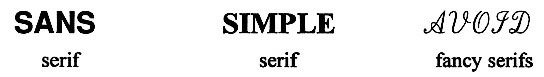
Raised characters are required to have simple, preferably no, serif. Fancy serif styles make tactile reading difficult. Recommendations: Raised borders can confuse tactile reading of raised (and Braille) characters. They should be avoided or spaced away from raised text.
Braille is read with a light sweeping touch using the pad of the finger, not the tip. It is important that the vertical projection of dots be rounded, not straight (i.e., mounds, not cylinders).
| Recommended Braille Specifications | |
| nominal height | 0.019 in |
| nominal base diameter | 0.057 in |
| nominal distance (center to center) of adjacent dots in same cell | 0.092 in |
| nominal distance (center to center) of the corresponding dots in adjacent cells | 0.245 in |
| nominal line spacing of braille cells (center to center of nearest corresponding dots in adjacent lines) | 0.400 in |
| (Source: specification #800, National Library of Congress) | |
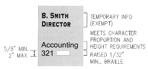
Grade II Braille is different from literary Braille by using standard word contractions. A character symbol is used to distinguish numbers from letters since the same characters are used for both. Similarly, a character symbol is used to indicate capitalization. Recommendations: Capitalization should be used for the first letter of proper nouns and names but not for "restroom" or "exit." Unlike raised letters, Braille is not provided in all caps (which would require the capital symbol before each letter). Braille is usually located below or beside raised characters. Consistency within a building system is the important thing. If placed below (flush left or center), it is important that it be spaced far enough away from raised characters (and borders) so that fingers can be flush with the sign face.
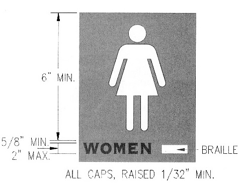
Where pictograms are used to label "permanent" rooms and spaces (e.g., restrooms), the verbal equivalent must be provided in raised and Braille characters. This does not apply to pictograms providing information about a room or space, including the access symbol. Since pictogram symbols vary in their shape and proportion, a minimum size is specified for the background, which in effect governs symbol size. The minimum height (6 inches) applies to the symbol field, excluding raised and Braille text. Pictograms are not required to be raised but must meet requirements for finish and contrast.
User Comments/Questions
Add Comment/Question