Signage [4.30]
The Society for Environmental Graphic Design (SEGD) has prepared guidance in applying ADAAG signage requirements based on certain industry conventions. This information is contained in a "White Paper" available from SEGD. Some of this information has been included here with permission.
Scoping [4.1.2(7), 4.1.3(16)]
Specifications for signage apply according to the type of sign provided. ADAAG does not require building signage except to identify certain accessible elements and spaces.
Tactile Signage
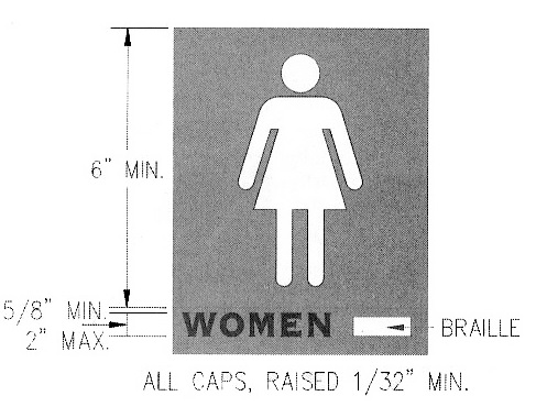
Raised and Braille characters are required on signs that "designate permanent rooms and spaces." This is intended to cover signs typically placed at doorways (i.e., room and exit labels) because doorways provide a tactile cue in locating signs. (Other types of signs that can be placed variously along circulation routes may not be easily found by people with little or no vision.) The requirement for raised and Braille characters also applies to signs labeling rooms whose function (and thus designation) is not likely to change over time. Examples include signs labeling restrooms, exits, rooms/floors by number or letter. Recommendation: Tactile signs are recommended for room names not likely to change.
Requirements for tactile signage apply to exterior sites but are not intended for building names (except at rail stations) or addresses.
Non-Tactile Signage
The legibility of printed characters is a function of the viewing distance, character height and proportion, font, and the color contrast between character and background, the finish, and the lighting. Specifications for character size and proportion and sign finish and contrast apply to signs providing information about a room or space ("Employees Only"), direction to rooms, spaces and building elements, labeling not required to be tactile of elements and rooms ("Service Entrance"), rules of conduct, and overhead signs.
| TACTILE | NON-TACTILE | |
| Character Proportion Font/ Style | raised characters: · sans or "simple" serif · upper case only |
· width-to-height ratios for character & stroke · lower case allowed |
| Character Height | · raised characters: 5/8" - 2" (raised 1/32" min.) |
· based on viewing distance · 3" min for overhead signs |
| Braille | · grade II required | N/A |
| Pictograms | where provided: · 6" min. field height · raised & Braille verbal description below (pictograms are not required to be raised) |
access symbols required by ADAAG: · specified content · color contrast (other types not covered) |
| Finish & Contrast | · light/dark contrast · non-glare finish |
· light/dark contrast · non-glare finish |
| Location | · 60" height to centerline on wall at latch side of doors | · 80" min. vertical clearance for overhead signs |
Temporary Signage
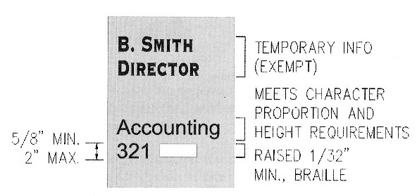
Temporary signs, which are exempt, include identification of tenancies, names and titles of room occupants, non-fixed signage and temporary postings ("Out of Service," "Under Renovation"), and other information subject to change (building directories, posted menus, hours of operation).
Pictogram
Pictograms can improve access for people with cognitive or learning disabilities, children, and others who may have a limited reading ability. ADAAG however requires the display of certain symbols to label various accessible spaces and features [4.30.7]. Requirements for tactile text apply to pictograms used to label "permanent" rooms and spaces (e.g., restrooms) where provided. Pictorial symbols used for other types of signs (e.g., no smoking, occupant logos) are not addressed by ADAAG.
Character Proportion [4.30.2]
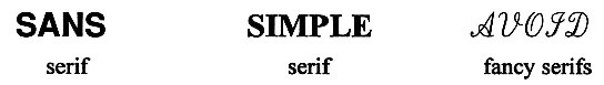
Very thick or thin characters and character strokes can be difficult to read. Recommendation: While ADAAG does not specify the character to use in calculating proportions, SEGD recommends the capital "O" and number "0" for character proportion and the capital "I" and number “1" for stroke proportion as adequately representative of letterforms.
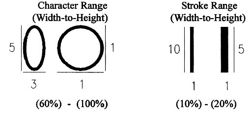
Recommendations: Styles with "simple" or no serifs (required for raised letters) are preferred over styles, such as script or old English, that can be difficult to read. Consider uniform stroke widths which can make signs easier to read.
Character Height [4.30.3]
Characters must be sized according to the viewing distance although a minimum 3 inch upper case or capital letter height is required for overhead signs (i.e., above 80 inches for adequate headroom).
Recommendations: Both the horizontal and vertical viewing distance should be considered. The viewing location upon which calculations are based may be difficult to pinpoint in long corridors and large rooms. SEGD recommends a minimum 75 feet viewing distance for such areas. Traffic patterns and sign function may also be important factors to consider. Consider a minimum 1 inch cap height for every 25 feet of viewing distance (horizontal) with 5/8 inch the minimum as recommended by SEGD. Further guidance is also available from the CABO/ANSI A117.1‒1992 standard which recommends heights based on the mounting height (1 inch minimum height for signs mounted from 48 to 60 inches above the floor and a 2 inch minimum for those above 60 and below 80 inches).
Raised and Brailled Characters and Pictorial Symbol Signs [4.30.4]
Raised characters are required to have simple, preferably no, serif. Fancy serif styles make tactile reading difficult. Recommendations: Raised borders can confuse tactile reading of raised (and Braille) characters. They should be avoided or spaced away from raised text.
Braille is read with a light sweeping touch using the pad of the finger, not the tip. It is important that the vertical projection of dots be rounded, not straight (i.e., mounds, not cylinders).
| Recommended Braille Specifications | |
| nominal height | 0.019 in |
| nominal base diameter | 0.057 in |
| nominal distance (center to center) of adjacent dots in same cell | 0.092 in |
| nominal distance (center to center) of the corresponding dots in adjacent cells | 0.245 in |
| nominal line spacing of braille cells (center to center of nearest corresponding dots in adjacent lines) | 0.400 in |
| (Source: specification #800, National Library of Congress) | |
Grade II Braille is different from literary Braille by using standard word contractions. A character symbol is used to distinguish numbers from letters since the same characters are used for both. Similarly, a character symbol is used to indicate capitalization. Recommendations: Capitalization should be used for the first letter of proper nouns and names but not for "restroom" or "exit." Unlike raised letters, Braille is not provided in all caps (which would require the capital symbol before each letter). Braille is usually located below or beside raised characters. Consistency within a building system is the important thing. If placed below (flush left or center), it is important that it be spaced far enough away from raised characters (and borders) so that fingers can be flush with the sign face.
Where pictograms are used to label "permanent" rooms and spaces (e.g., restrooms), the verbal equivalent must be provided in raised and Braille characters. This does not apply to pictograms providing information about a room or space, including the access symbol. Since pictogram symbols vary in their shape and proportion, a minimum size is specified for the background, which in effect governs symbol size. The minimum height (6 inches) applies to the symbol field, excluding raised and Braille text. Pictograms are not required to be raised but must meet requirements for finish and contrast.
Finish and Contrast [4.30.5]
All signs covered by 4.30 must have a non-glare finish, such as matte or eggshell. Recommendations: An eggshell finish is recommended. Consideration should also be given to light sources and the ambient lighting to prevent glare on sign surfaces. Examples of acceptable and unacceptable finishes, according to SEGD, include:
| Material | Acceptable | Unacceptable |
| finish paints and inks | eggshell, matte | gloss or semi-gloss |
| acrylic sheet, mylar, frosted glass | most non-glare types | polished surface |
| self-adhesive vinyl film | most non-glossy types | glossy |
| metal | certain satin or random brushed finishes | polished or directional brushed finishes |
Recommendations: Light characters and symbols on a dark background are generally considered easier to read than dark-on-light (either is allowed). A contrast of at least 70% based on the light reflectance value is recommended.
Mounting Location and Height [4.30.6]
Placement of tactile signs aside doors (latch-side) provides safety since locating signs on doors that swing out is hazardous. It also provides uniformity which makes signs easier to find by people with little or no vision. (This is why tactile signs are not permitted on doors that swing-in). The 60 inch centerline height also provides uniformity as well as convenience in reading signs from a standing position. Recommendation: At signs containing pictograms or other non-tactile information, this should be measured to the centerline of the raised/ Braille portion so that it is not too low (or high).
Space must be available for a close approach outside the swing of doors. It is important that fixed elements (e.g., drinking fountains) and furnishings not obstruct the approach. The wheelchair maneuvering clearance required on the pull side of doors should allow adequate space.
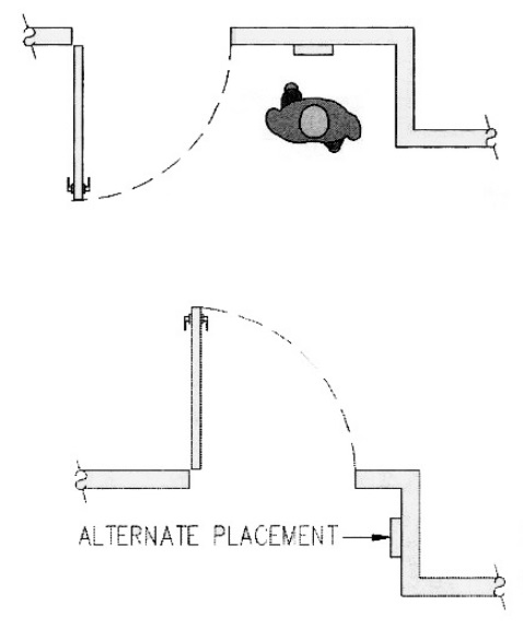
Where adequate wall space is not available on the latch-side, signs are to be placed on the nearest adjacent wall surface. At double doors or entries with no doors, signs can be placed on either side although attention should be paid to predominant traffic patterns and building-wide uniformity. At double doors, doors that easily swing back 180 degrees can be a hazard unless doors are equipped with closers or the sign is placed beyond the full swing. Where other codes or standards specify a different location (e.g., illuminated exit signs overhead) redundancy is required.
Symbols of Accessibility [4.30.7]
ADAAG requires several types of access symbols. Color contrast between symbols and background is required but the color or size is not specified. Recommendations: Consider using:
-
light-on-dark, which is considered more effective than dark-on-light
-
contrast of at least 70 % (light reflectance value)
-
non-glare finishes
-
system-wide uniformity
The International Symbol of Accessibility is used to label accessible:
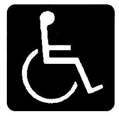
-
parking spaces
-
check-out aisles [7.3]
-
areas of rescue assistance (and directional signage at inaccessible exits and on routes to areas of rescue assistance)
and, unless all are accessible:
-
passenger loading zones
-
public entrances (and directional signage at inaccessible entrances)
-
toilet and bathing facilities (and directional signage at inaccessible locations)
Other required symbols include:

used to identify the location of text telephones (TTYs), including on directional signs required at banks of telephones without TTYs
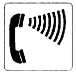
used to identify phones equipped with volume control

used to indicate the availability of assistive listening systems in assembly areas (can also be used to provide notice of other auxiliary aids and services such as real time captioning, sign language/oral interpretive services)
Illumination Levels (Reserved) [4.30.8]
Recommendations: Due to variations in field conditions, illumination levels are not specified in ADAAG. A level from 10 to 30 footcandles is recommended uniformly over the sign surface. Signs should be located so that the level on the sign surface is not significantly exceeded by ambient light or bright lighting behind or in front of the sign.
User Comments/Questions
Add Comment/Question