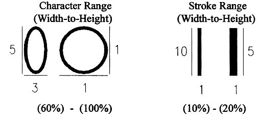
Character Proportion [4.30.2]
Very thick or thin characters and character strokes can be difficult to read. Recommendation: While ADAAG does not specify the character to use in calculating proportions, SEGD recommends the capital "O" and number "0" for character proportion and the capital "I" and number “1" for stroke proportion as adequately representative of letterforms.
Recommendations: Styles with "simple" or no serifs (required for raised letters) are preferred over styles, such as script or old English, that can be difficult to read. Consider uniform stroke widths which can make signs easier to read.
User Comments/Questions
Add Comment/Question