Exhibit Design Relating to Low Vision and Blindness: Tactile Mapping for Cultural and Entertainment Venues
Exhibit Design Relating to Low Vision and Blindness
Tactile Mapping for Cultural and Entertainment Venues
By: Steven Landau, President
Touch Graphics, Inc.
330 W. 38 St., Suite 1204
New York, NY 10018 USA
800-884-2440
Steven Landau, Research Director
Email: sl@touchgraphics.com
Landau, S. (2010). Tactile mapping for cultural and entertainment venues (White paper). Indiana University, Bloomington, IN.
This paper has been supported by the National Center on Accessibility, the National Park Service and the U.S. Access Board through Task Agreement J2420070133 under Cooperative Agreement H0500000011.
I get lost a lot in museums. I sometimes go to check out a particular exhibit, but forget about that after getting distracted by something I’ve noticed along the way. So, I wander around without a clear plan, in hopes of stumbling on something stimulating. While this behavior can lead to serendipitous discoveries and unexpected juxtapositions and overlays, museum staff usually prefers visitors to travel purposefully to destinations where they are likely to learn the most, and to move about in fairly predictable ways. While a certain amount of meandering is to be encouraged, the overall goal of planners is usually to organize things clearly, and to increase the ratio of time spent engaging with exhibits and watching performances over time spent finding things.
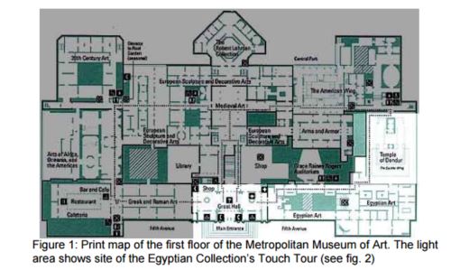
Architects, exhibit designers and visitor studies professionals think carefully about wayfinding and orientation when conceiving layouts for museums and other public entertainment venues. They work hard to ensure that visitors will be able to easily locate interesting exhibits and other destinations, like restrooms, cafeteria and (importantly) the gift shop. Still, many visitors find it very challenging to navigate effectively in large facilities, even when consulting a print map that they carry with them. For example, visitors to the Metropolitan Museum in New York often complain about getting lost; given the vastness of the place, it’s not surprising. Most non-locals seeking a specific room or collection at the Met are reduced to finding and asking a member of the museum staff for directions. Obviously, museums are motivated to introduce maps and signage that makes it easier and more intuitive to move about efficiently, providing everyone with a clear sense of their current position in relation to destinations relevant to their interests, and maintaining a good understanding of the extents and shape of the overall building or campus.
Given the challenges that average users report in finding their way in large museums, it is not surprising that visitors with disabilities that interfere with mobility, orientation and reading print signage and graphics find it especially hard to cope, and often avoid museums entirely (Friedman, 2000). Research shows that tactile representations, especially when combined with audio and visuals, can provide print disabled individuals with an improved impression of spaces they occupy and move through (Lederman & Jones, 2006). This paper reports on several existing, and a few more speculative, strategies for presenting multi-sensory way-finding and orientation information. The goal of all of these products and research projects is to create tools that improve visitor satisfaction and learning outcomes at museums, performing arts facilities, and at other entertainment venues.
Portable tactile maps
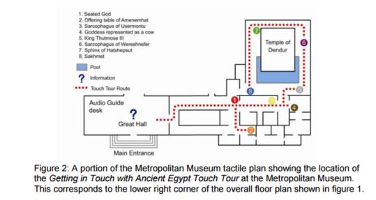
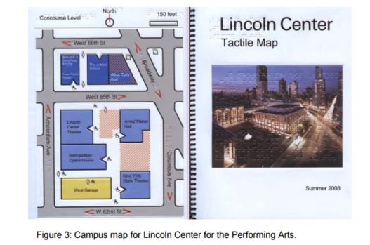
The most obvious way to provide spatial information for visually disabled visitors is to offer portable raised-line and textured (tactile) maps that can be carried and consulted en route. These are accessible representations of building and campus layouts available to visitors on demand. Usually, these maps are provided in multi-page booklets. Ideally, they include information presented in several ways to ensure legibility by the largest possible audience. See, for example, map of the Getting in Touch with Ancient Egypt Touch Tour at the Metropolitan Museum (fig. 2) and the Lincoln Center for the Performing Arts Tactile Map (fig. 3). These maps include large print and Braille text, raised lines, and texture fills to show spatial arrangements, and a legend to identify destinations, and the meanings of symbols.
A number of techniques have been used to produce portable tactile maps, including vacuum forming three-dimensional shapes onto pre-printed vinyl sheets (e.g., the Lincoln Center map), embossing on paper, and “capsule paper”, where you draw with a black pen on special paper, then heat up the paper to make the black lines puff up. All maps that you carry share one big deficiency: by definition, they lack a fixed point of reference, so there can be no You Are Here marker. Anecdotal evidence suggests that users generally find it difficult to develop a strong sense of their current position in the context of a map while in motion, and without access to visual landmarks and signage that can be matched to things on the map. Nevertheless, well made tactile maps are useful, especially when the spaces shown are simple, and rendered in a very limited palate of tactile features (Blades & Spencer, 1987). Experienced tactile map designers try to restrict themselves to using no more than three distinct line types, three different textures and four or five point symbols, such as stairs and building entrances (Rowell and Ungar, 2003). Other rules of thumb include restrictions on crowding, and proper use of Braille labeling (Edman, 1992).
Fixed position maps and kiosks
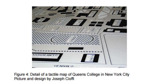
Tactile maps can also be mounted on walls and pedestals in locations where visually impaired individuals will be likely to find and identify them. These maps should be made of durable materials, since they have to withstand significant wear and tear when used as intended, and because they will be exposed to vandalism and, in cases of outdoor installations, moisture, extreme temperatures and UV radiation that can rapidly degrade unsuitable materials. Fixed position maps have been made out of various materials, from CNC-milled plastic to photographically-etched magnesium metal (see figure 4), cast metals and resins, and 3D printing.
While it is normally more convenient and practical to mount these maps on vertical surfaces, as is typical for publicly displayed maps, it is better to place tactile maps on a horizontal or near-horizontal surface. This is because tactile map readers need to imagine themselves in the environment depicted, and it is easier to do this when the orientation of the map matches reality (Ionides and Howell, 2004). When maps are placed on vertical surfaces, readers need to constantly shift their frame of reference in order to build an imaginary model of reality that they will (hopefully) retain once they are no longer looking at the map. For similar reasons, it is always desirable to rotate horizontally-mounted tactile maps so that their direction matches the real world. This way, when examining things to the left of the You Are Here marker, the reader knows that those things are actually to his left in the real world. However, it is often not practical to mount tactile maps on dead level surfaces, because they quickly become tables on which thoughtless people leave their trash.
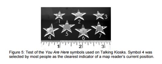
Good tactile cartography requires significant user testing to ensure that symbols, line types and textures will be readable and clear to the multiple constituencies who must be considered as potential users. As an example of the kind of research that is required to maximize usability across populations, consider the experiment carried out by Touch Graphics in developing a universal You Are Here marker that is intuitive to both blind and low vision audiences, as well as to the general public (see figure 4). We found that sighted map readers are familiar with the convention of a red star to indicate the station point of a map, but that this symbol is not known or intuitively understood by tactile readers without (recent) visual memory. We produced seven versions of a multi dimensional star symbol and asked 12 individuals to rate them for clarity as a You Are Here marker. The clear winner was a star with a fingertip-sized concave depression in its center (sample number 4 in figure 5).
With the results of this experiment in hand, we were able to produce a series of Talking Kiosks for New York City that use this symbol (fig. 6). These kiosks include translucent acrylic touch-sensitive maps placed on top of LCD flat panel displays on sloping counters (fig. 7). This enabled us to light up the map brightly, which is often helpful for viewers with low vision. Also, this approach permits us to highlight different elements on the maps as they are touched, providing visual emphasis and interest for sighted passers by, who appear to enjoy interacting with the kiosk, too.

Talking Three-Dimensional Models for Way-finding
In contrast to raised-line maps, touchable models provide more spatially accurate information, but also have some limitations, and are never portable. Models are probably more intuitive to use for an inexperienced or young blind user as compared to tactile maps, which require additional layers of abstract thinking. People generally find it easier to draw a spatial analogy between the physical world and a scale model than to comprehend a raised-line map of the same space. I speculate this is because tactile map map-reading involves transposing three-dimensional space into a 2D format by taking an imaginary slice through the world. This seems like a more cognitively involved mental function than understanding that a model is a miniature version of reality. On the other hand, scale models show information about building volumes and details that are irrelevant to a tactile reader who is planning a walking route, because they don’t need to know, for example, how tall a building is in order to walk there at ground level.

A few museums and public places offer tactile models that visitors are allowed to touch, such as the outdoor bronze model at the Getty Center in Los Angeles (see fig. 8). Given the complexity and the irregular shapes of the Getty, the model does an admirable job of presenting an overall sense of the layout. There are some Braille labels on the buildings and a clear You Are Here marker. Richard Meier’s Getty’s model is really a beautiful object, set at a prominent spot on the campus, and is useful for orientation, but probably not very helpful for way-finding, because there is no descriptive information that would help blind travelers to actually navigate from the model to a various destinations on campus.
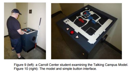
In another example, the Carroll Center for the Blind has recently installed a talking tactile campus model. Students at the center hear audio descriptions about each element that they touch (see figures 9 and 10). This talking map is specifically intended for use in wayfinding and orientation, and was designed in collaboration with staff at the Carroll Center to ensure that the talking model would serve as a useful tool in familiarizing new students with the layout of buildings, pathways, and noteworthy landmarks for way-finding, like bus stops, low walls and railings. Information is provided in a series of audio layers that are accessed by continuing finger contact with a single part of the model. These layers are: element name (for example, “Centre Street”, “Bus Stop”); location (in respect to the current position in front of the model); functional description; and locations of doors for entering and exiting buildings. In comparison to non-interactive models like the one at Getty Center, it’s clear that users need on-demand descriptions of model elements to really understand what they are looking at. Just as audio-tactile displays like TTT and IVEO1 bring raised-line graphics to life through a multi-sensory approach, for a visually impaired individual experiencing the model through touch sense, this kind of audio labeling provides the crucial key to comprehension.
1 IVEO is a trademark of ViewPlus Inc. of Corvallis, OR. TTT refers to Talking Tactile Tablet, an audio-tactile device from Touch Graphics, Inc. of New York, NY.
More speculative approaches
Map-kiosk hybrid
Touch Graphics' proposal for a new kind of universal way-finding system combines cheap, disposable maps with discreet, fixed-position map-reader pedestals in galleries and other program spaces (see fig. 11). This approach provides all visitors, including those with disabilities, with customized maps they carry with them. Unlike ordinary print maps, these have a You Are Here marker that changes position as you move through the facility! How it works: a visitor places his personalized translucent map onto the illuminated tray of the reader (see fig. 12), in the correct orientation to match the real world (it only fits on the reader pedestal in one way). The map includes a bar code that allows the pedestal to "recognize" the visitor; once identified, the pedestal displays a large, bright You are Here marker, which shows through the translucent map so that it appears in the correct location on the map, and also shows a path from the current position to the places he wants to go (these destinations would have been recorded for that visitor at a simple map- producing kiosk in the museum’s lobby. Accessibility features, including optional raised lines or large print, could be added to the maps on request). This idea demonstrates principles of Universal Design, which calls for information to be presented in multiple formats. It's a lowcost way to improve the usefulness of carry-maps, which museum visitors are already comfortable using, by adding context-relevant way-finding and orientation assistance.
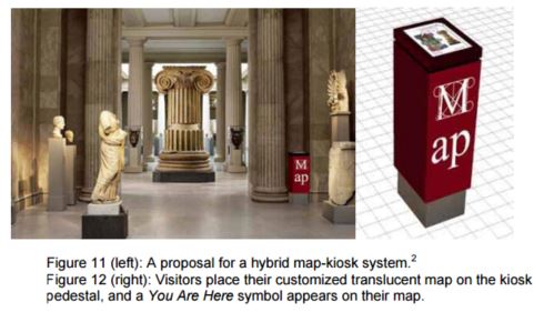
2 The images shown here illustrate a proposal for an installation of a map/kiosk network at the Metropolitan Museum of Art in New York City. The proposed system is not currently under consideration for installation at the Met, and these images, including the Met logo, were created by Touch Graphics, Inc. without permission or consultation with staff at the Met.
Interactive Illuminated Models
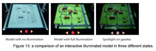
Another promising new development expands on the concept of touch sensitive talking models by projecting light onto the model’s 3D surface. This concept is demonstrated in an experimental version of the Carroll Center Talking Campus map (see figure 13). Rather than painting the buildings and landscape to provide high contrast visuals (as in the original Carroll Center project shown in figure 10), here the model is all-white, greatly simplifying model fabrication and painting. A downward facing LCD video projector bathes the surface of the model with HD video, with moving images, and text labels. When part of the model is touched, the overall illumination of the model dims, except for a spotlight of bright light shining on the part that was touched. This adds emphasis that may be helpful for low vision users, and is somewhat jaw-dropping for those with normal vision. Adding cars and figures in motion on the surface of the model, and casting accurate shadows across the surface of the model based on time of day creates an uncannily realistic miniature tableau, and it’s hard to resist interacting.
Conclusion
In 2008, after an action by the US Justice Department, the Spy Museum in Washington, DC, began offering tactile maps of their exhibit space as part of a settlement over the museum’s failure to live up to the spirit (if not the letter) of the ADA3 . Disability rights advocates hope that The Spy Museum case will serve as an example of the government’s commitment to enforcement of existing laws, and will spur cultural and entertainment providers everywhere to begin offering way-finding accommodations for print-disabled visitors. While it’s impossible to say for certain, the museum world appears to be strongly behind this the inclusive approach, motivated both by concerns about possible exposure to penalties, and a desire to deal equitably with all visitors. The examples of tactile cartography discussed in this white paper capitalize on underappreciated aspects of our sensorium. We perceive the world, in part, through pressure and movement of materials and surfaces against our skin, and we sense the instantaneous positions of our limbs as we move through, and take the measure of our surroundings. These overlooked information channels can be exploited by designers as they plan facilities, and by museum professionals as they orchestrate visitor experiences. This approach to Universal Design deepens interactive experiences for mainstream audiences, while reducing barriers to access; it promotes an ethic of inclusivity, and feels welcoming to visitors who might not otherwise venture into museums. And, it appears to be (slowly) catching on.
3 See settlement agreement between the US and the International Spy Museum. Online at http://www.ada.gov/spymuseum.htm.
User Comments/Questions
Add Comment/Question